
 monday.com · Guide
A checklist that reads 70% done tells you where you are, not where you are heading. Two teams can both sit at 70% on a Friday: one has been closing three steps a day and will land on time, the other closed nine steps early and then stalled. The board table treats them the same. monday.com checklist analytics exists to separate those two cases — to answer "are we actually on track?" rather than "how many boxes are ticked right now?"
The SOP & Compliance Checklists app records a daily snapshot of every checklist and builds a set of trend views on top of that history: a burn-up chart, a velocity trend, a projected finish date, per-person workload and an on-time SLA. This article walks through how to read each of those, why a trajectory beats today's percentage, and how the dashboard widget rolls the same picture up across several boards at once.
What monday.com checklist analytics measures
Before reading any single chart, it helps to know what the app is actually recording. monday.com checklist analytics is built on a daily snapshot of every checklist — how many steps existed, how many were done, who owned them and when they were due. From that history it derives five views: a burn-up chart, a velocity trend, a projected finish date, a per-person workload breakdown and an on-time SLA. None of these is a live counter you already have on the board; each one describes movement over time, which is the thing a percentage cannot capture.
The distinction is worth holding onto as you read the rest of this article. A completion percentage and a status column report a state. The analytics views report a rate and a direction — and it is the rate and direction that tell you whether a deadline is safe.
Why a percentage is not a status
A completion percentage is a single point. It answers "how much is done" and nothing else. It cannot tell you whether the remaining work will be finished by the deadline, because it carries no information about pace. The moment you care about a due date, you are asking a trajectory question, and a trajectory needs at least two points over time.
That is the core idea behind monday.com checklist analytics: instead of reporting a number, it reports a direction. By capturing a snapshot each day, the app can show the slope of progress — how fast steps are actually being completed — and extend that line forward to a projected finish. A flat or shallow slope near a deadline is the early warning the percentage alone will never give you.
The percentage tells you where the ball is. The trajectory tells you whether it is going to reach the goal. Only one of those lets you intervene while there is still time.
This is a different view from progress on the boardSurfacing completion onto a number or status column — so a rollup shows in the board table and dashboards — is covered in tracking checklist progress across your boards. That is about where the number appears. This article is about the trend and analytics view: reading the shape of progress over time to catch slippage. Use both together.
Reading the burn-up and velocity trends
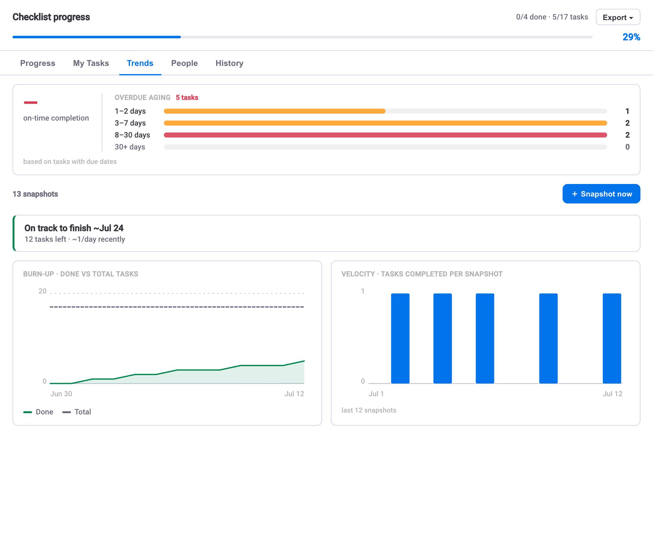
The burn-up chart plots completed steps rising over time against the total scope. Two things matter on it. First, the slope of the completed line: steep means fast progress, flat means a stall. Second, the gap between the completed line and the total: that gap is the work left, and you want to see it closing at a rate that reaches zero before the deadline, not after.
A burn-up (as opposed to a burn-down) also makes scope changes visible. If the total line steps upward mid-way, work was added — and a completed line that looked healthy against the old total may now be behind. Seeing scope and completion on the same chart stops you from mistaking "we did a lot" for "we are on track."
The velocity trend answers a narrower question: how many steps are being completed per day or week, and is that rate steady, rising or falling? Read it as the engine behind the burn-up. Three signals worth acting on:
- Falling velocity near a deadline — the most common quiet failure. The percentage still climbs, so nobody panics, but each day adds less than the day before.
- Velocity that never started — a checklist created days ago with a flat completed line usually means it was assigned but not picked up.
- Spiky velocity — long flat stretches broken by bursts often points to work that is blocked between bursts, which is where recurring routines with step dependencies can smooth the flow by surfacing the next unblocked step automatically.
The projected finish date, and how to trust it
The projected finish date takes the pace shown in your history and extends it forward to estimate when the remaining steps will be done. Set against a due date, it turns an abstract trend into a plain yes-or-no: on this pace, do we land before or after the deadline?
Treat it as a barometer, not a promise. Because it is built from recent completion history, it moves as behaviour changes — a strong week pulls the projection earlier, a stalled week pushes it out. That responsiveness is the point: when the projected finish drifts past the deadline, you have found the slip early, while there is still room to add help, cut scope or reorder work. Watch the direction the projection is moving as much as its current value.
Check the projection, not just the percentage, in stand-upsA useful habit: in a weekly review, open the analytics view and read the projected finish before the completion percentage. If the projection is inside the deadline, a low percentage is fine. If the projection is past the deadline, a high percentage is a trap. This reorders the conversation around the question that actually matters.
Per-person workload and the on-time SLA
Aggregate progress can hide a single overloaded person. The per-person workload breakdown attributes checklist steps to their owners — drawn from the people assigned on each step — so you can see whether the remaining work is spread evenly or piled on one owner who will become the bottleneck. If the burn-up is flattening, workload is often where the reason lives: one person holds most of the open steps.
The on-time SLA measures how much work is completing by its due date versus slipping past it. Where velocity tells you the pace and the projection tells you the destination, the on-time SLA tells you about reliability — a team can be fast on average yet routinely miss individual step deadlines, and that pattern is what erodes trust in a plan. A declining on-time figure is a signal to look at how due dates are being set as much as how work is being done.
All of this is built from the daily snapshots the app keeps, and — like everything in the Checklist app — it runs entirely on monday.com infrastructure. The history that powers these charts lives in your monday.com account; no external database, no separate hosting, no data leaving the account.
Rolling analytics up across boards
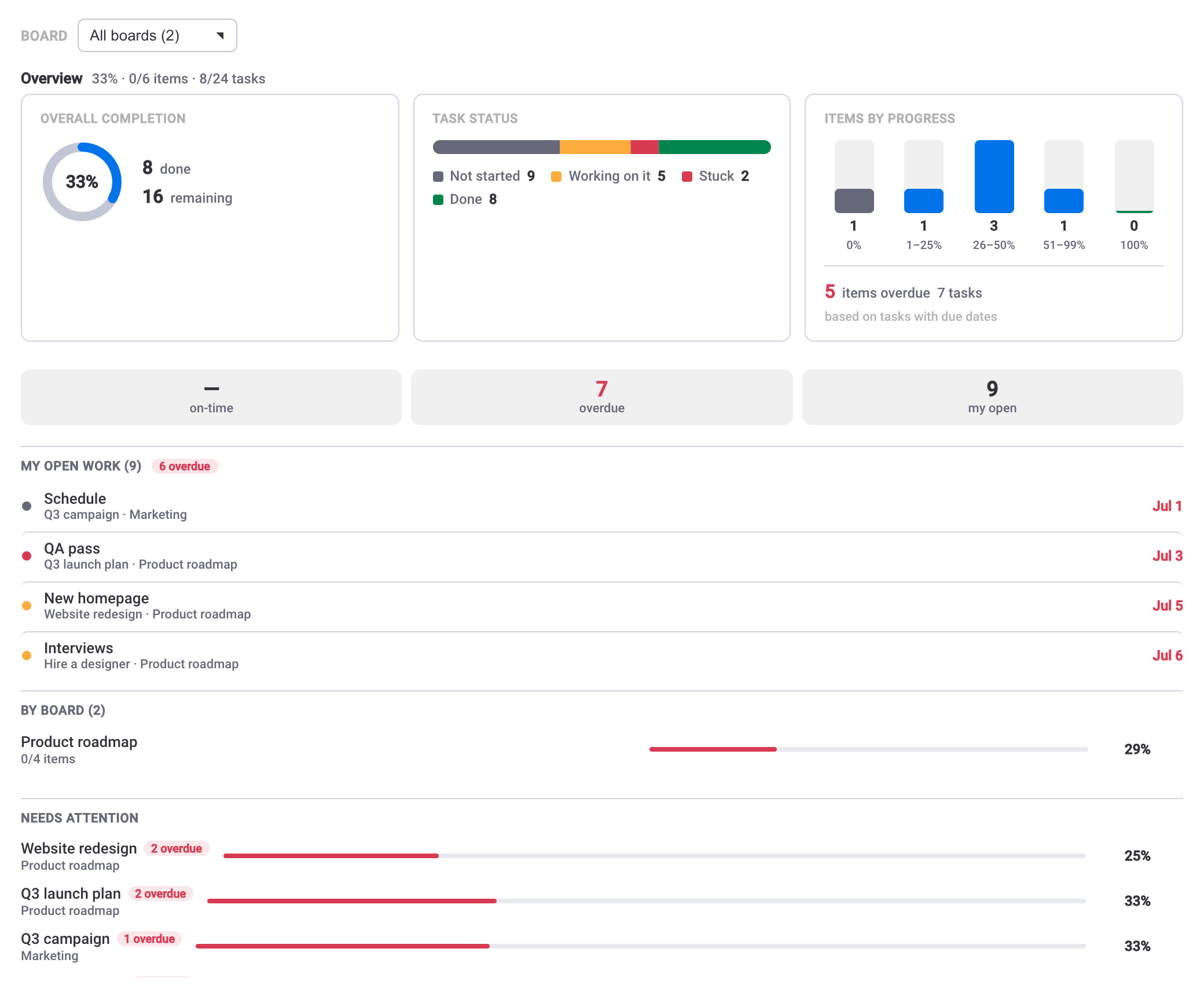
A single checklist's analytics answer "is this item on track?" When you run many boards, you need the same question answered one level up: across everything, where is the risk? The dashboard widget rolls checklist progress up across multiple boards, with a per-board breakdown and a needs-attention list, so a programme lead can scan the portfolio without opening each board.
Read the widget in two passes. The per-board breakdown gives you the shape — which boards are healthy and which are lagging. The needs-attention list gives you the shortlist — the specific items that have fallen behind and warrant a look. Together they turn "check every board" into "check these three," which is what makes a portfolio view usable day to day. For the mechanics of getting completion onto the board in the first place, see tracking checklist progress across your boards.
A simple weekly reading routine
You do not need to stare at every chart. A short, repeatable pass over the analytics catches most slippage early:
- Start at the dashboard widget. Scan the needs-attention list to find the boards and items at risk this week.
- Open the analytics for anything flagged. Read the projected finish first — is it inside the deadline?
- If it is not, look at velocity. Is the rate falling, or was it always flat? That tells you whether the problem is a recent slowdown or a checklist that never got going.
- Then check per-person workload. If one owner holds most of the open steps, redistribution is usually the fastest fix.
- Glance at the on-time SLA over time. A steady decline means the plan's due dates need attention, not just the work.
Run that pass weekly and the analytics stop being a report you look at after the fact and become an early-warning system. The percentage still has its place for a quick glance, but the trajectory is what lets you act while acting still helps.