
 Jira · Guide
A dashboard tells you what is stuck right now. A report tells you why it keeps happening. Most teams stop at the first half: they chase today's overdue tickets, ship the sprint, and never look at the pattern underneath — so the same status eats the same three days, sprint after sprint.
Time in Status — Status Aging Alerts for Jira calculates five reports from a single scan of your project: a time-in-status matrix, sortable averages, an aging WIP scatter, a ping-pong report, and a cumulative flow diagram. Each answers a different question, and reading the wrong one for the question at hand is how teams talk past each other in retros. This guide walks through what each report shows, how to read it, and when to reach for it.
How the five reports work
All five reports are computed from the same project scan — the transition history of your issues, read against the per-status thresholds you configure. That has two practical consequences. First, the reports agree with each other and with the dashboard: an issue that is bold red in the matrix is the same issue sitting past the threshold line in the aging WIP chart. Second, the numbers are as fresh as the last scan, and each report says so — a "Calculated N min ago" stamp sits next to the title, so you always know whether you are looking at this morning's picture or last week's.
Every report also carries a short explainer of what it measures and a CSV download, which we will come back to at the end. If your team counts only working hours, the reports respect business-hours mode too — see business hours vs calendar time for why that matters.
The time-in-status matrix: where the hours went
The matrix is the densest of the five and the best place to start a retro. Rows are issues, columns are your workflow statuses, and each cell holds the total time that issue has accumulated in that status — summed across every visit, so a ticket that entered review twice shows both stays combined.
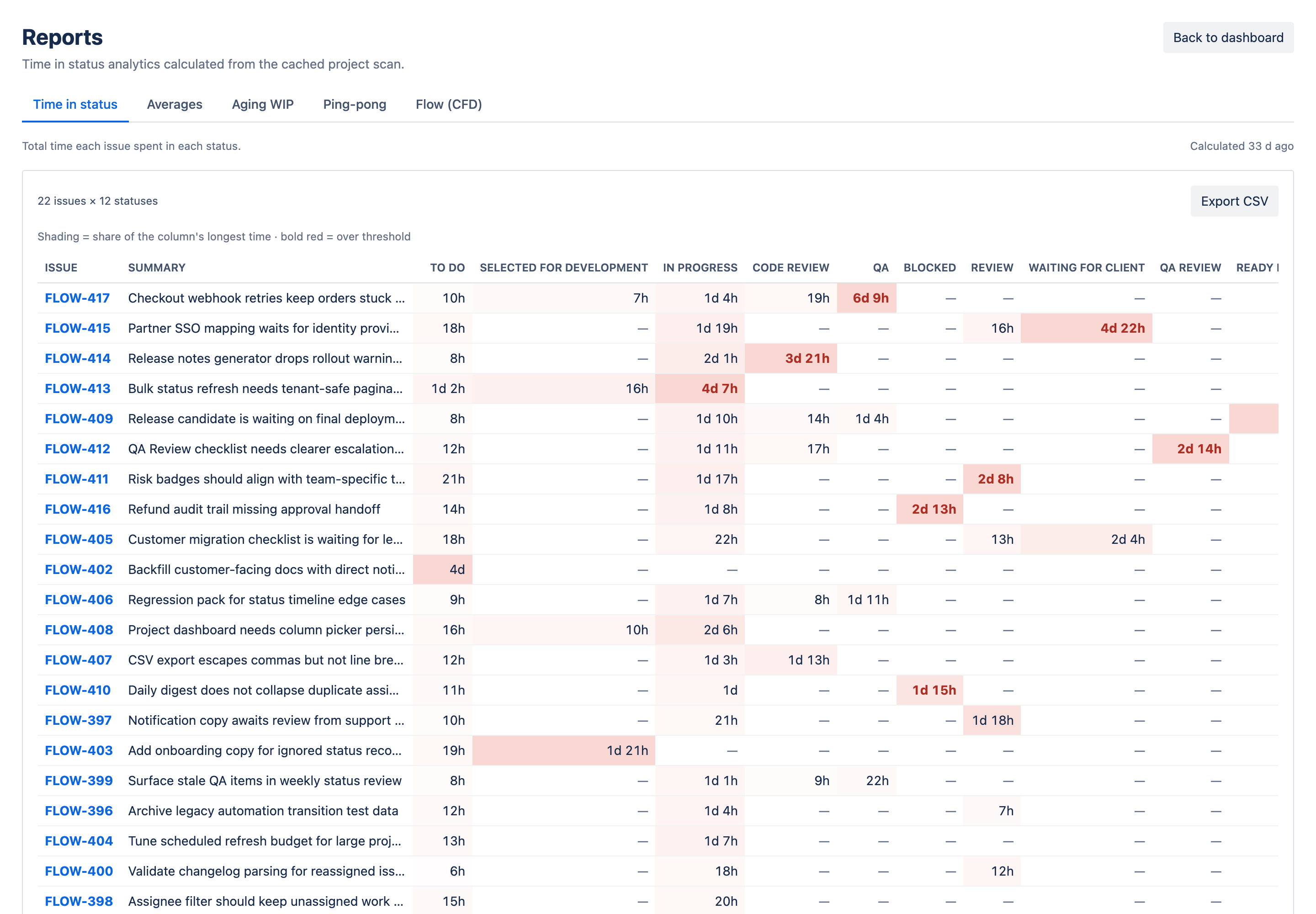
Two visual layers make it readable at a glance. Heat shading darkens cells in proportion to time, so your eye finds the concentrations without reading a single number. And any cell that has crossed the threshold you set for that status is rendered in bold red — the matrix does not just show where time went, it shows where time went past what you said was acceptable.
- Scan the columns: a dark vertical band means a status where many issues linger — that is a bottleneck, not bad luck. Confirm it against how to find Jira workflow bottlenecks.
- Scan the rows: one dark cell in an otherwise light row is a single stuck issue with a specific story — usually a named blocker.
- Count the red: scattered red cells are outliers to chase; a red column is a threshold that no longer matches reality, or a stage that needs structural help.
Averages: the report that sets your thresholds
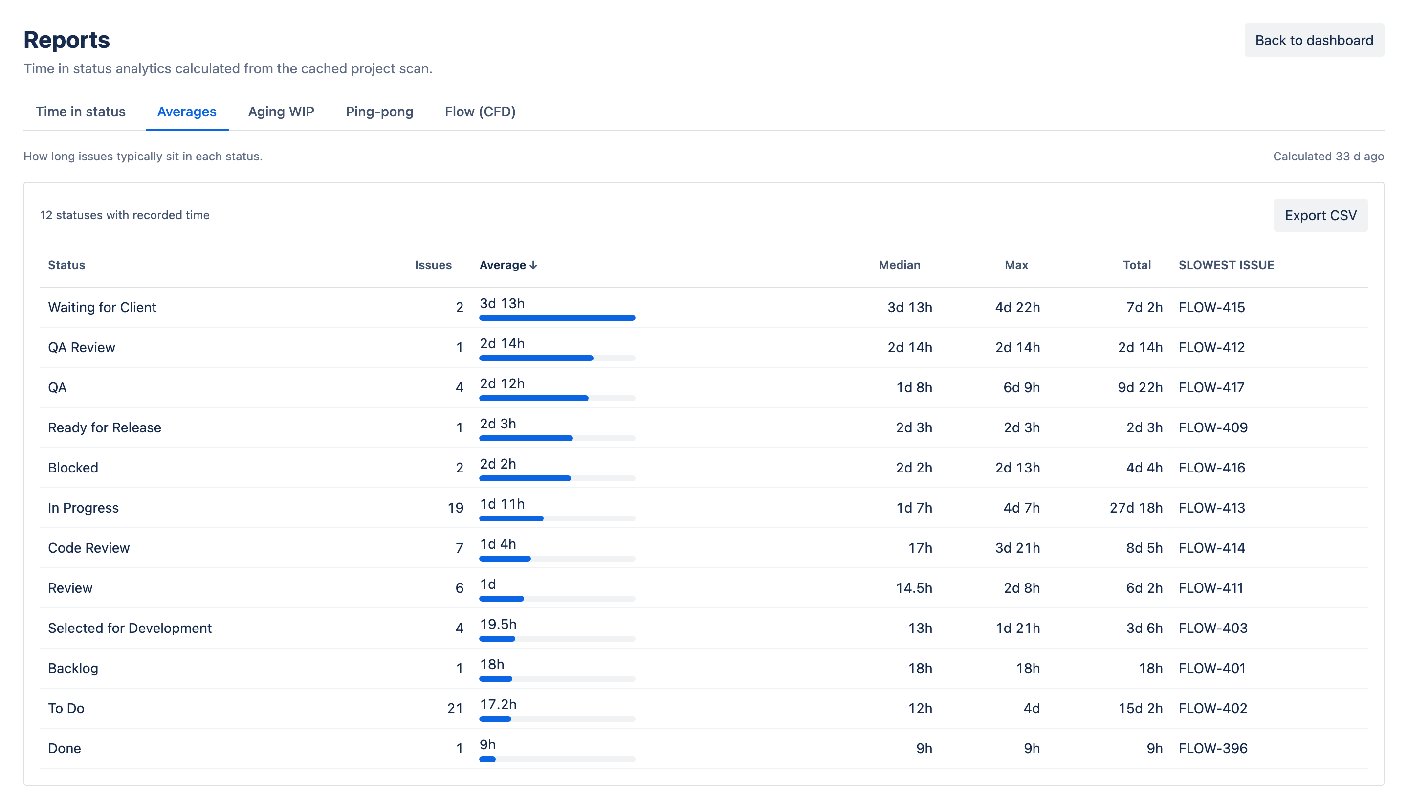
The averages report collapses the matrix into one line per status: the average time issues spend there, sortable so the most expensive stage sits at the top. It is the least dramatic report and arguably the most important, because it is the empirical basis for everything else — thresholds, at-risk buffers, and sprint commitments all start from "what does this stage normally take?"
Set thresholds from averages, not ambition
Open the averages report before you touch threshold settings. A threshold slightly above the observed average flags genuine outliers; a threshold set from a wish flags everything, and the alerts stop being read. Revisit quarterly — averages drift as the team and the workflow change.
Aging WIP: who to chase today
Where the matrix looks backward, the aging WIP report is a snapshot of right now: a scatter of your current in-flight issues, each plotted by how long it has already sat in its present status against the threshold for that status. Issues past their threshold sit visibly beyond the line — no interpretation needed.
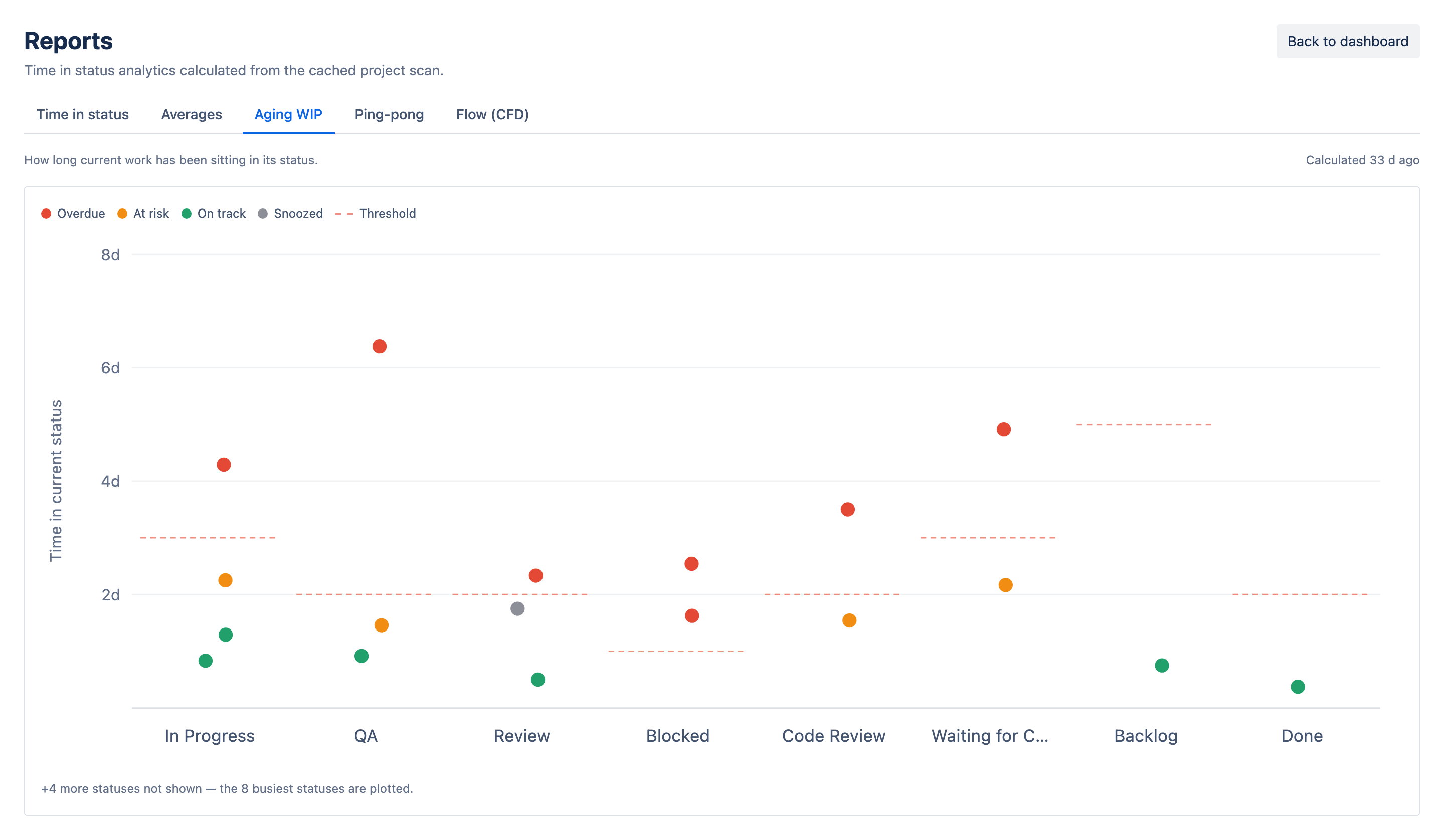
This is the report to open in standup. It answers "which issues are overstaying right now" — the same question the dashboard's Overdue tile answers, but with the depth of seeing near-misses too: a cluster of points crowding the threshold without crossing it is next week's overdue list, visible a week early. For the triage routine once you have the list, see how to find stuck Jira issues.
Ping-pong: the rework detector
Dwell time has a blind spot: an issue that bounces between In Progress and In Review four times may never sit long in either status, so it looks healthy in the matrix while quietly burning a week of rework. The ping-pong report closes that gap by listing issues that oscillate between two statuses, with the bounce count for each pair.
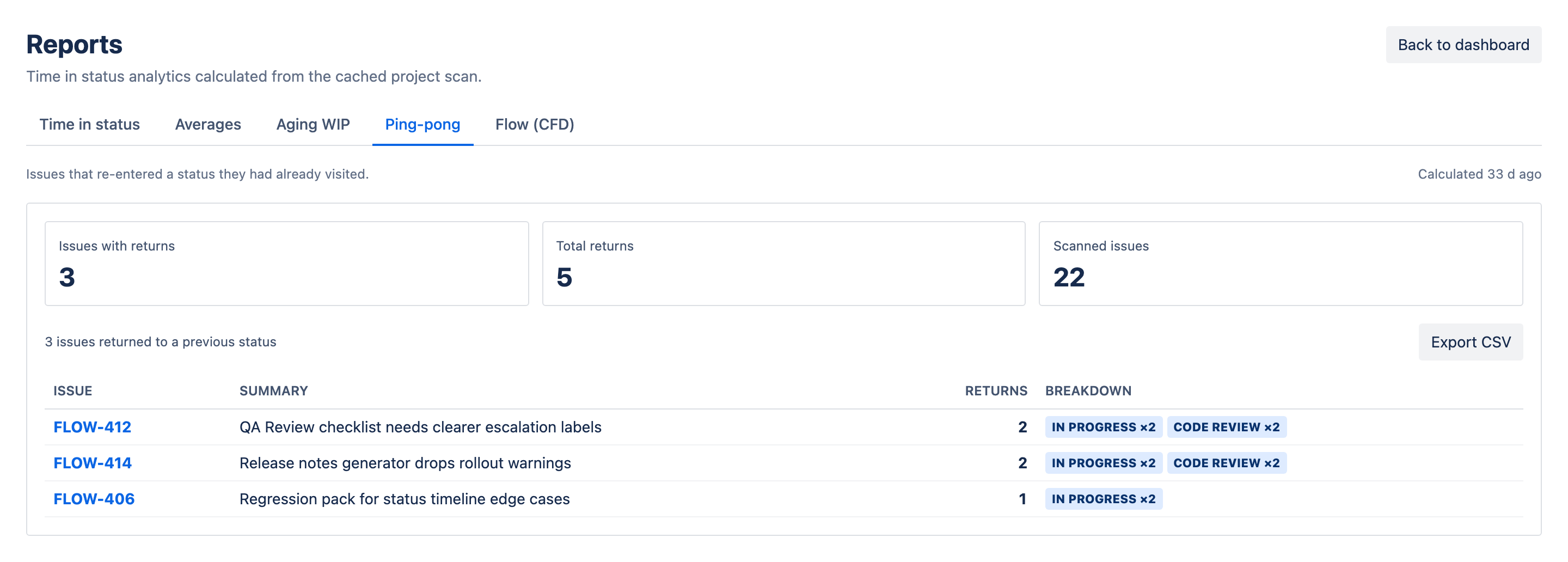
Read the pairs, not just the issues. A pile of bounces between development and review usually means an unclear definition of done or review standards that live in one reviewer's head. Bounces between QA and In Progress point at test environments or handoff quality. Either way, the fix is a process conversation — which is exactly why this pattern needs its own report: no threshold on a single status will ever catch it.
Flow (CFD): is the system getting better?
The cumulative flow diagram is the wide-angle lens. Each status is a colored band stacked over time; the band's height at any date is how many issues sat in that status. It is the one report that shows the system rather than individual issues.
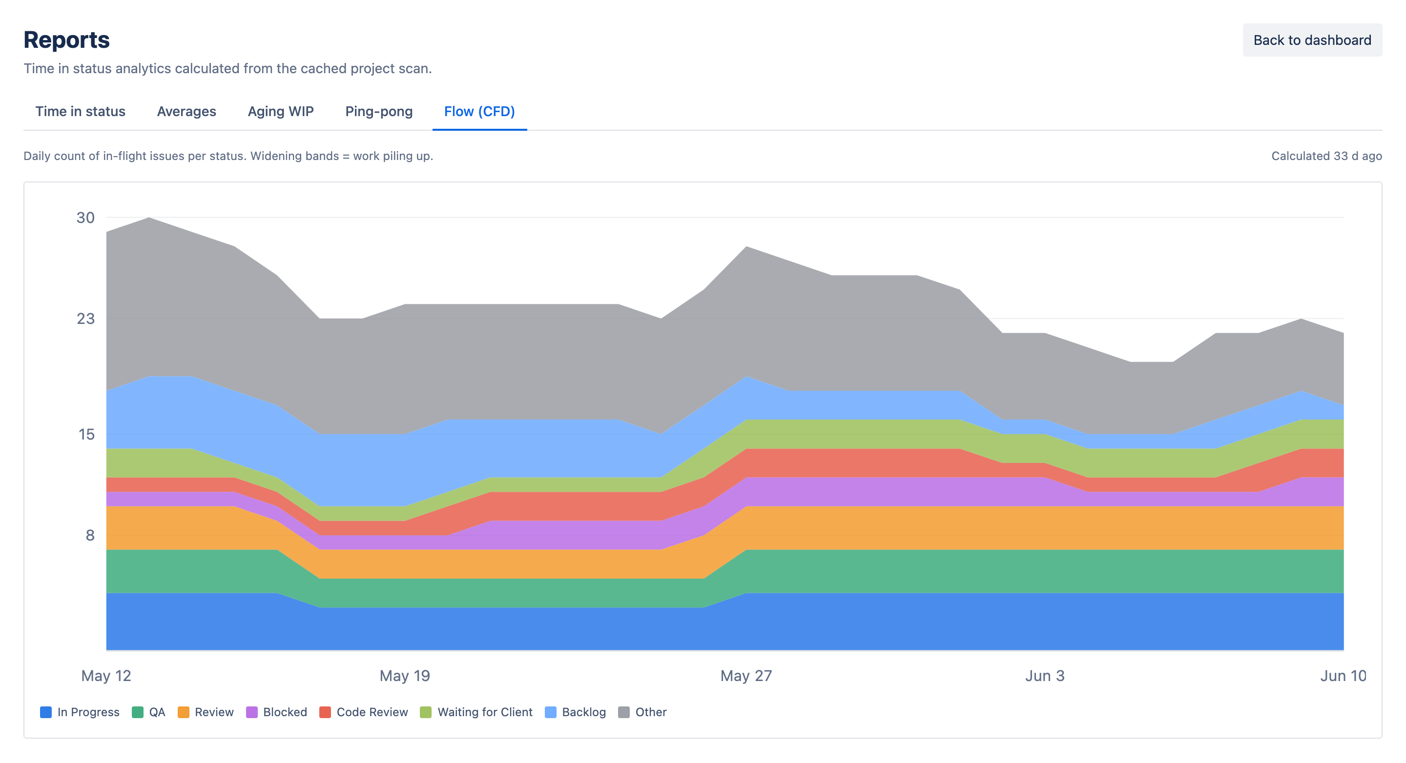
- Parallel bands — arrivals and departures are balanced; flow is healthy.
- A widening band — that status is accepting work faster than it releases it; this is a bottleneck forming in slow motion, weeks before the matrix turns red.
- A flat top edge — nothing new is entering the system; a flat bottom edge means nothing is finishing.
The CFD is the report for monthly reviews and for checking whether a change actually worked: cap WIP in review, and the review band should visibly narrow over the following weeks. It pairs naturally with the playbook in reducing cycle time in Jira.
Which report when
Five reports sounds like four too many until you map them to the questions your team actually asks. The mapping is clean:
- "Where did the time go last sprint?" — the matrix. Columns for systemic problems, rows and red cells for specific ones.
- "What should our thresholds be?" — averages, sorted descending.
- "What do we chase today?" — aging WIP, in standup.
- "Why does finished work keep coming back?" — ping-pong.
- "Is flow improving quarter over quarter?" — the CFD.
Use two cadences, not five
In practice this collapses to a daily habit and a retro habit: aging WIP every morning, and the matrix plus CFD every retro, with averages and ping-pong consulted when those two raise a question. Nobody needs to study five charts a day.
CSV export: take the numbers with you
Every report has a CSV download next to its freshness stamp. That matters more than it sounds: the report view answers today's question, but the CSV lets you keep answering it later — archive a snapshot each sprint and you get a longitudinal record no single scan can show, or pivot the matrix by assignee in a spreadsheet, or paste hard numbers into a quarterly deck instead of a screenshot. The dashboard's issue table exports the same way, so the live view and the analytical one share one escape hatch to wherever your reporting actually lives.
Reports are the half of time-in-status that compounds. Alerts save this week's slip; the matrix, the averages and the CFD are how next quarter's workflow stops producing slips in the first place. Run the scan, read the five answers, and let the data — not the loudest retro voice — decide what to fix.